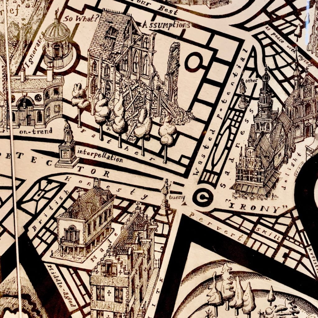
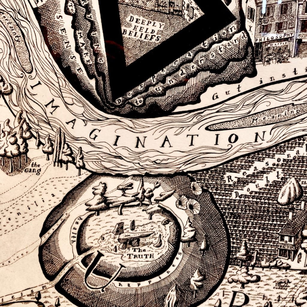
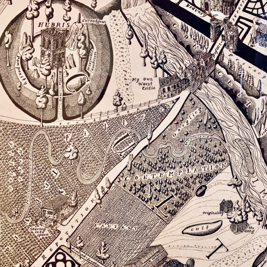
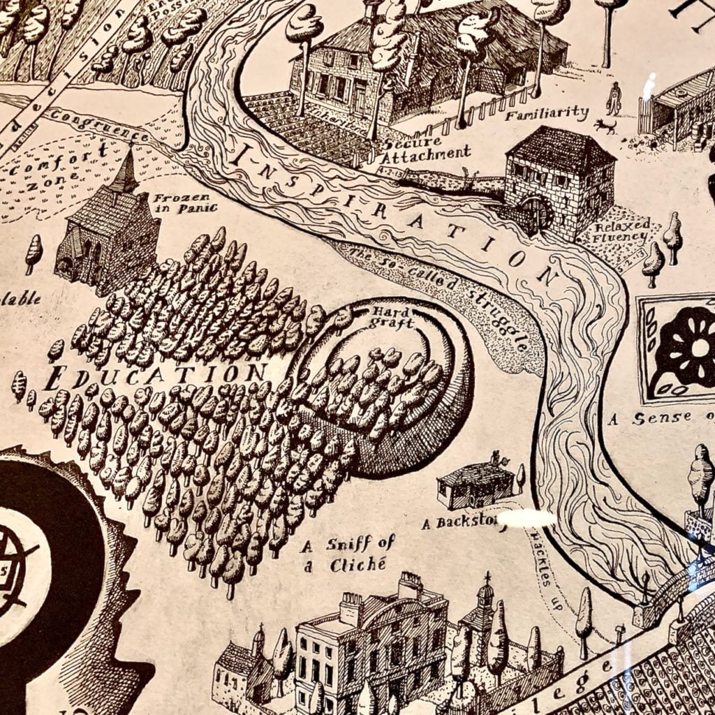
I’ve always loved old maps – particularly the illustrated ones of London & the Thames. My parents had a copy of one with ‘fluvius’ written through the water – it was enlarged & filled a large part of a wall in their bedroom but the detail was still small & just wonderful. When I first saw Map Of Days by Grayson Perry it reminded me so much of that image but this perhaps was even better. The detail, word play & humour in it was just brilliant. It was so intriguing I really wanted to see more.
I have always been an admirer of the applied arts if I’m honest rather than fine art. I love graphic design & illustration – particularly the skill of it whereas sometimes fine art can be all about concept (I said sometimes!) For example I recall seeing some of Dali’s work up close whilst in Barcelona & being really disappointed. Grayson to me straddles many camps being a potter, illustrator, architect, thinker & fine artist. Look at these wonderful images…
I first started to admire the creativity of Grayson Perry when I saw the most fantastic house he designed – House for Essex. It is a wonderful building & so fantastically different -Again the detail is incredible from the ground to the sky & all the way through – look it up!
His talent is endless so when I saw an article saying his Map of Days featured in an exhibition nearby I just had to go. I’ve been working really hard lately including weekends & have been a bit knackered – so I thought it might do me good to skive off for a day & see something other than a garden or a French chateau. I’d completed all I needed to so headed off to to Worcestershire. We took the dog as Croome has excellent dog walking spaces & my husband fancied a day out too. He’s not a fan of Grayson though so I parked him & the dog at a picnic table & shot off. It’s quite a long walk from the cafe to Croome Court itself but thankfully the sun was shining. It’s quite an imposing building but has very friendly staff & I soon found the exhibition.
There were three large tapestries & two of his prints but the lighting & reflection on the glass were so bad it really spoiled the look of them. It was a shame so I’ve just shown elements here which are amazing. As a textile designer in my previous life I really appreciate the design elements – the illustrative qualities & the movement. Quite brilliant!
It’s funny as I applied to do an MA after my BA in textile design many years ago. I was offered a place at Huddersfield but The Royal College of Art turned me down for their degree in tapestry – damn good job as it turned out! Not keen on tapestry any more & I’m SO much better at designing gardens.
Here’s some more of Grayson’s beautiful drawing & I’ll see you next time
