This is the story of how the garden design process for one reason or another can be a little protracted but we always get there in the end. This is about the evolution of one particular garden design. The entrance at Pip’s Place in the Chilterns.
I first met Ginni during the summer of 2018 & took the photo below of her then recently completed house. You can see photos of Pip’s Place in my portfolio that show how it has developed in 3 phases so far. I liked Ginni immediately & really loved this fabulous project! It was pretty much a blank canvas & was totally up my street. Thankfully Ginni felt the same & commissioned me to crack on & sort it out. We were both excited at the prospect. The photos here on my website show phases 1 – 3 & this is the story of phase 4 – the entrance.
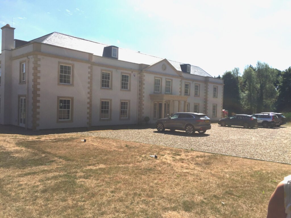
garden work started
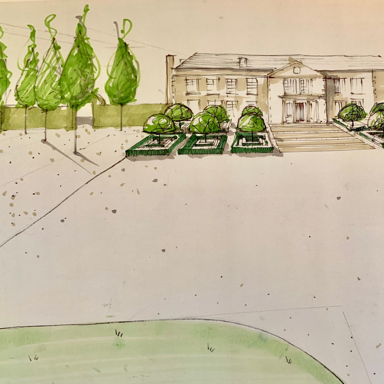
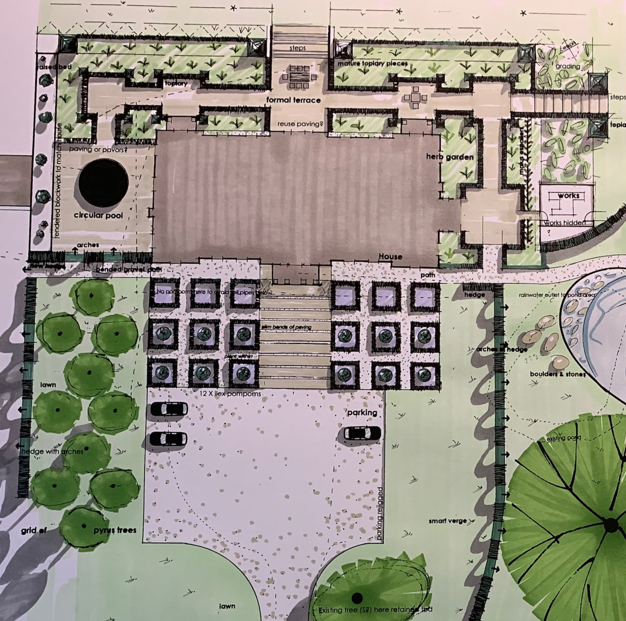
The drawings above show my initial plan & sketch of a formal entrance that consisted of smart topiary squares & a wide entrance of beautiful stone paving. We’ve previously used Artorius Faber & the plan was always to use more of their beautiful British quarried bespoke paving & steps. The idea for this was to nestle the building into the landscape but also reflect the formality of the Georgian style architecture. I felt the house was a tad stark & wanted it to feel more of a comfortable – still grand – country house. Full steam ahead phase 1!
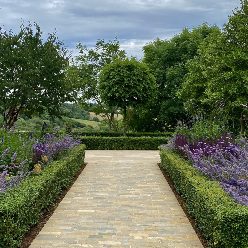
Construction work began on the secret garden design, the courtyards around the house & most recently, the pond. They are as I write in October 2022 looking quite fabulous! I took these in the last couple of weeks…
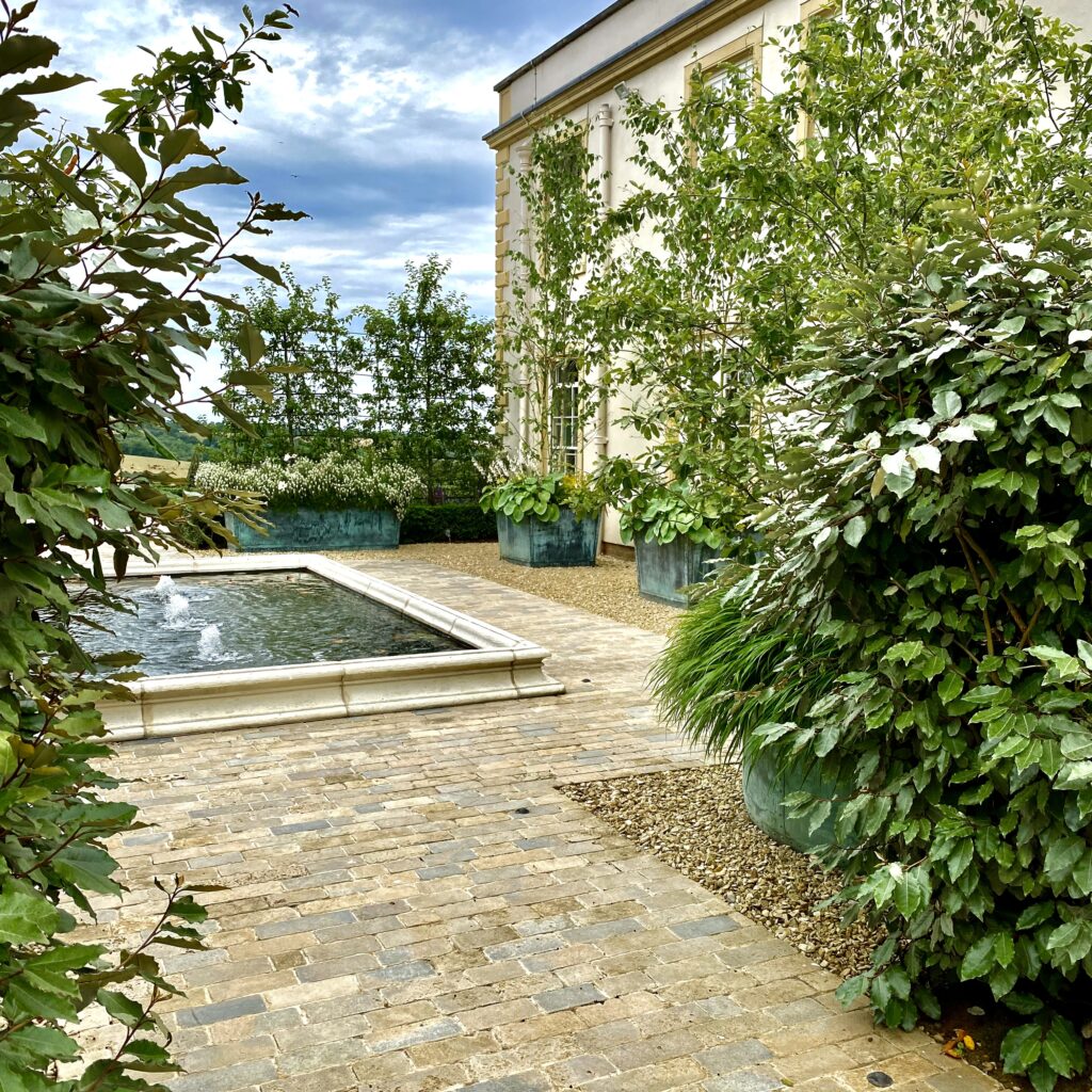
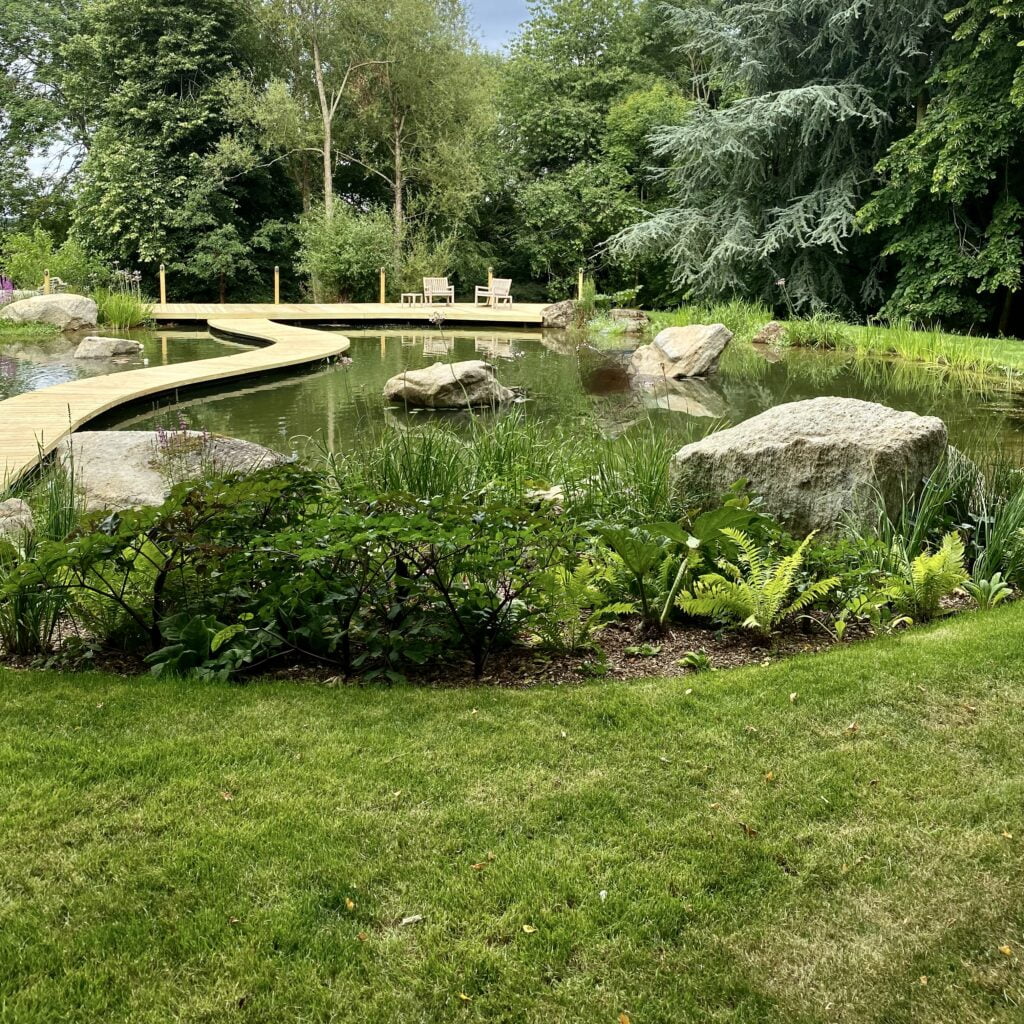
Meanwhile discussions on this area have been ongoing… A survey was subsequently undertaken of the services below ground beneath the area directly in front of the house. That revealed a network of pipes & wires. The feeling was therefore to place the topiary in huge planters instead as we had had to do in our own garden here at Manor Farm Barn. Our reason was the high water table but the solution was the same. These are my drawings below. Two groups of 5 very large bespoke square planters & a grand entrance to the front door spanning the width of the portico. I proposed mature taxus topiary pieces similar to those we used in the secret garden or elegant pyramids.
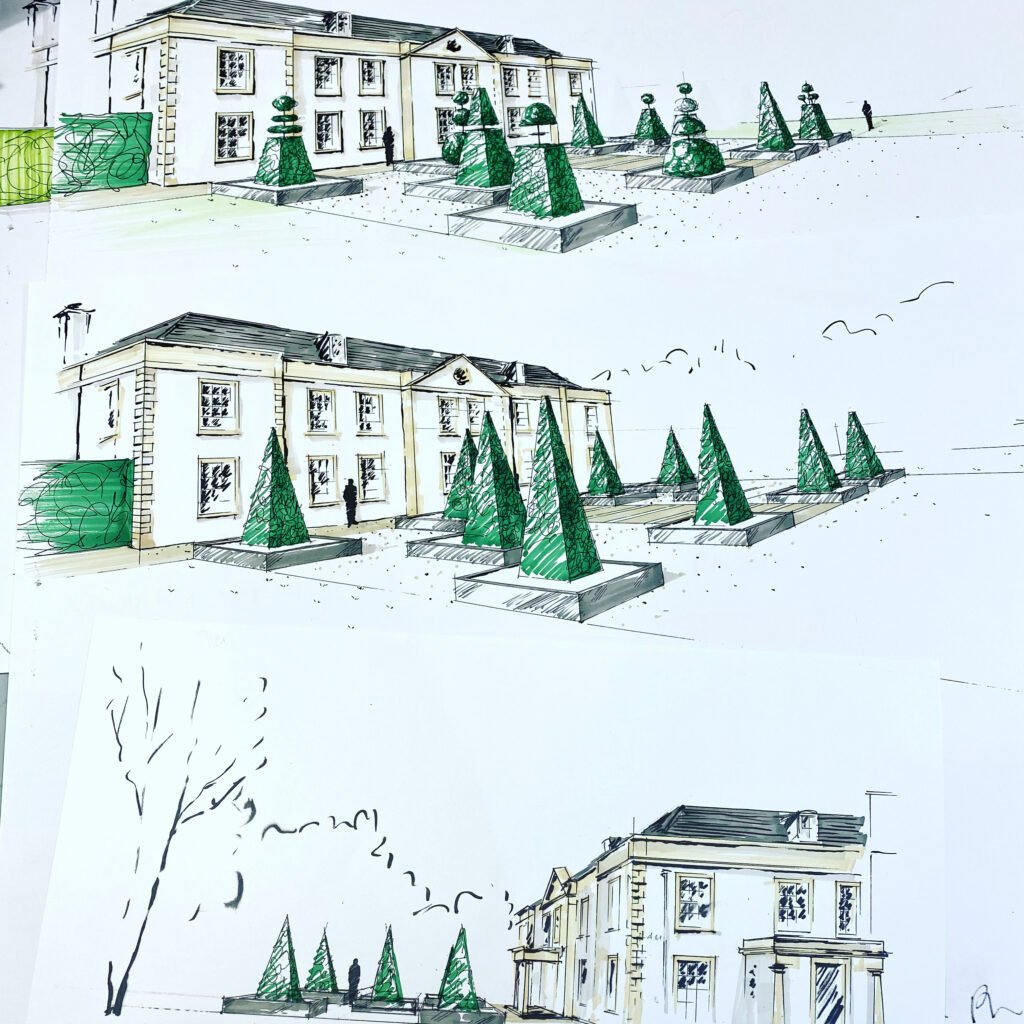
Unfortunately we have since discovered Glis glis (edible doormice) & athough in my opinion incredibly attractive, are a real problem in the Chiltern Hills where Ginni lives. They have actually damaged some of those mature (& expensive!) yew topiary pieces in the secret garden.

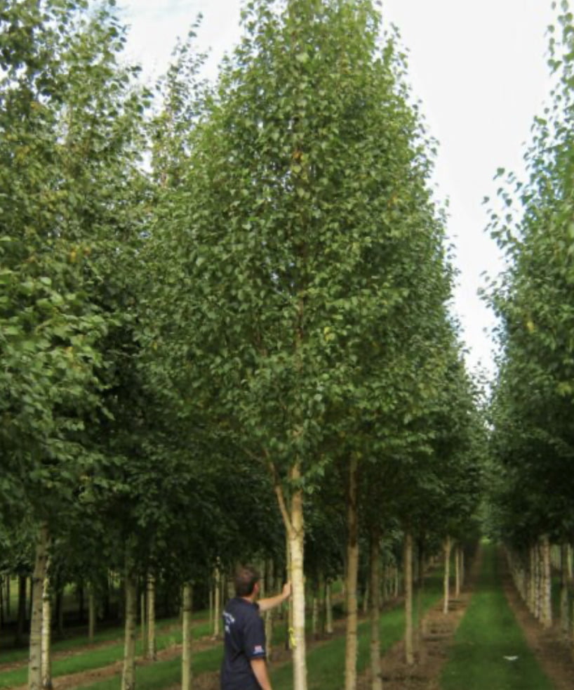
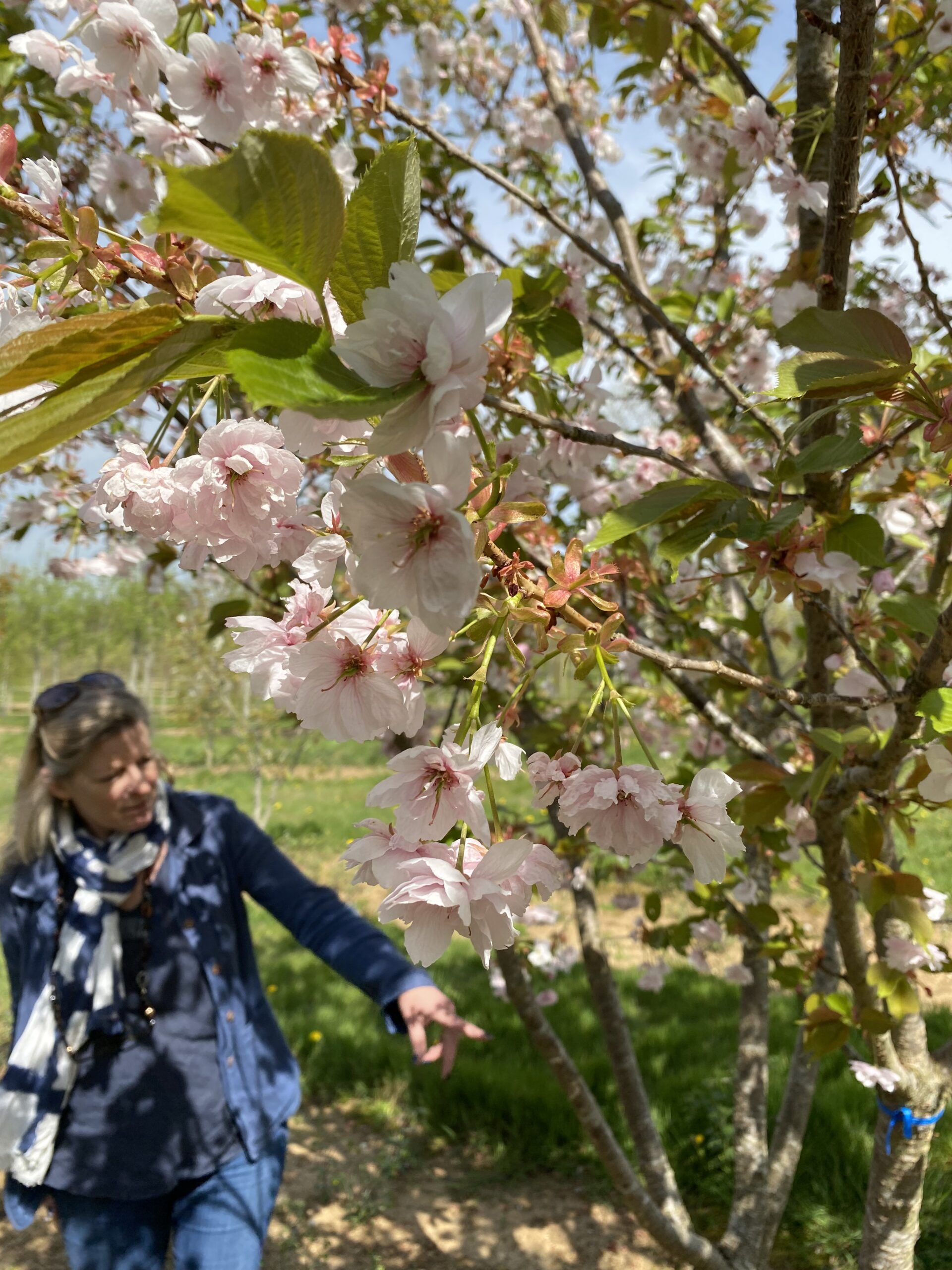
This, although not disastrous thankfully, is a problem we needed to avoid. We decided therefore to rethink the topiary & go tree shopping. One of our go-to tree nurseries is Hilliers where we meet James Hillier (Jim to us) & embark on a tree safari. On the day, Ginni fell in love with their Edinburgh birches & we all loved their mature Ichyo cherries. See below…
I therefore went away & drew how they might look for Ginni to assess. These drawings are below
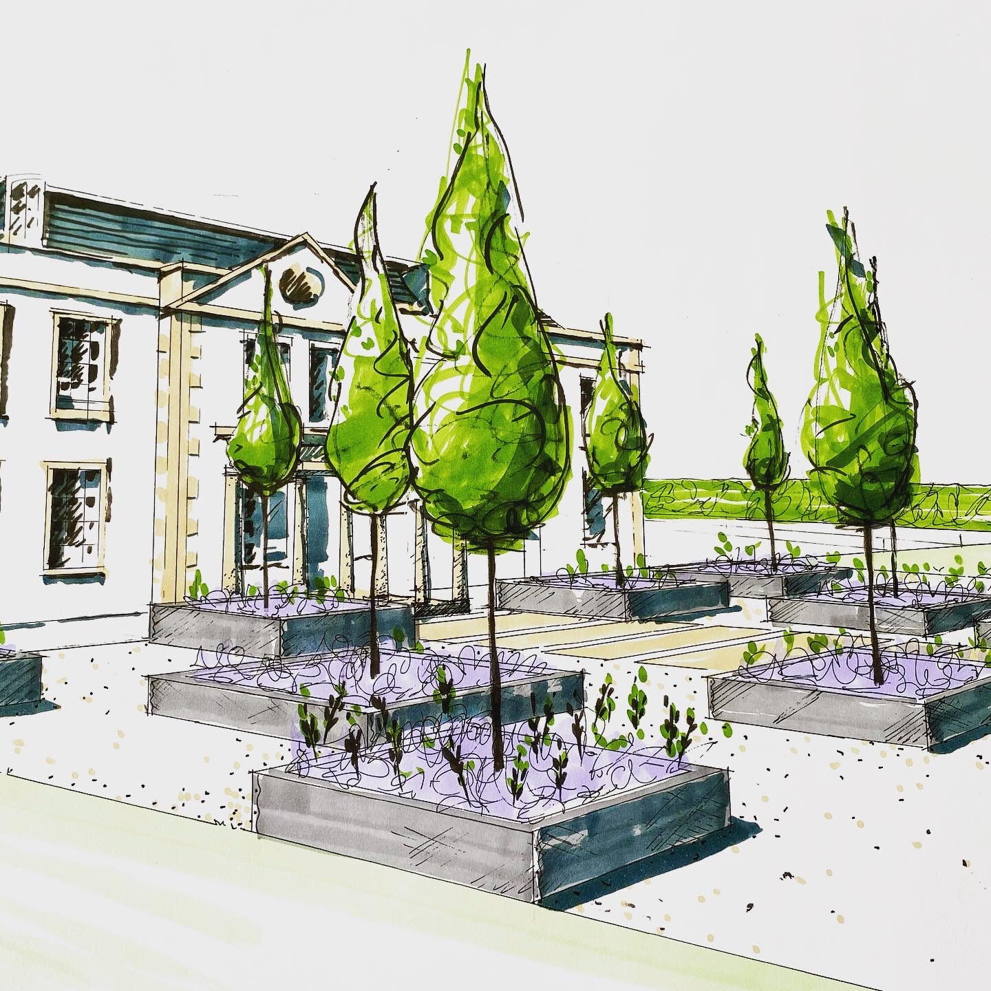
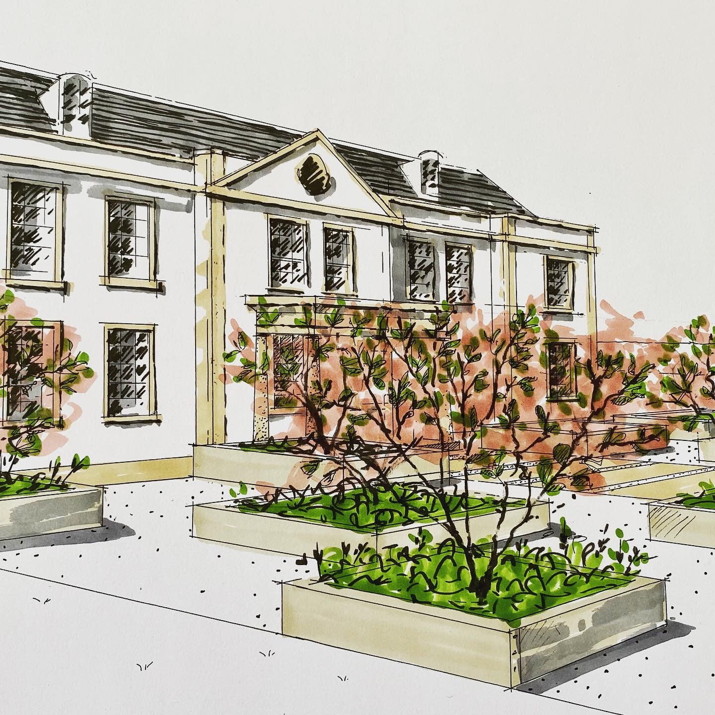
Ginni’s husband decided he wanted a more pared back look for the front & ideally a lawn. Ginni & I brainstormed a bit more & the garden at Blakes Hotel in London by Anouska Hempel popped into my head.
…as you can see it’s a lovely design consisting of 3 simple concentric squares within the walled garden that looked very elegant. Ginni liked the idea so I went back to my drawing board…
I ended up producing several plans for Ginni & her husband to peruse. Quite wonderfully because I was only proposing 2 mature trees, the rootballs will only impact 1 water pipe which can comfortably be rerouted. We can therefore do away with the planters for a softer less commercial (my fear!) look. My presentation meeting was yesterday & included Rob Jones of The Garden Design Co who will be converting my scale drawings into 3 dimensions. He & his team have built phases 1 – 3.
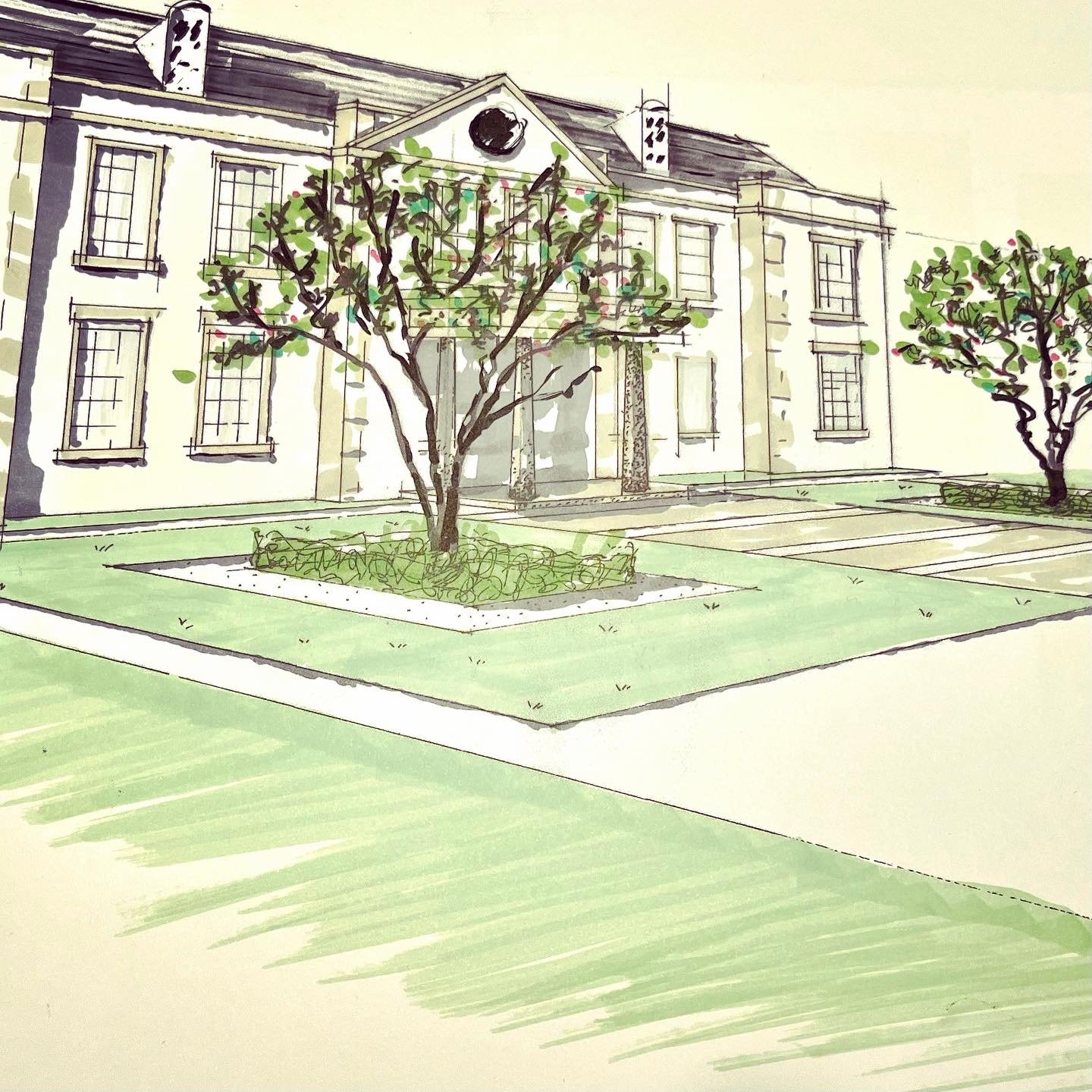
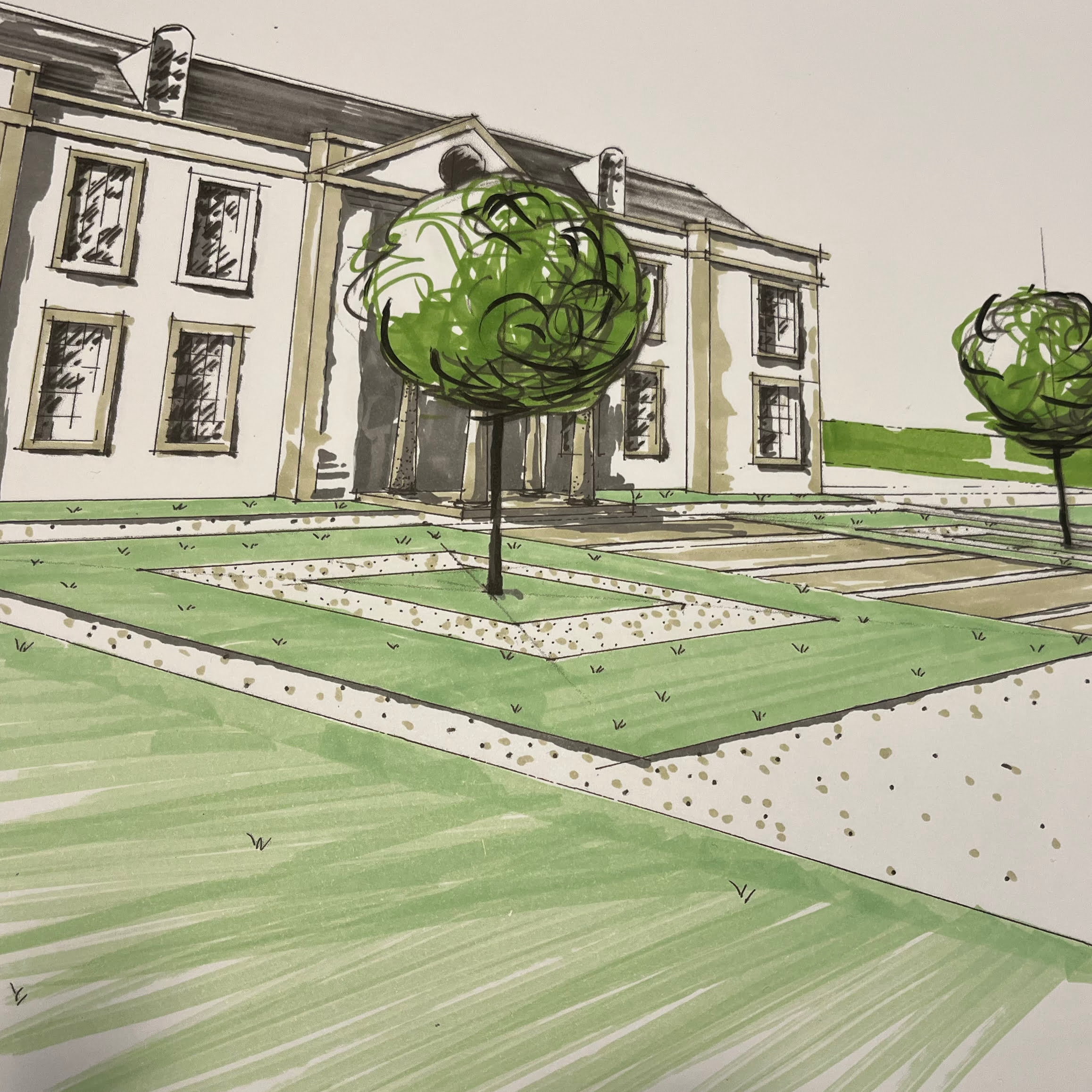
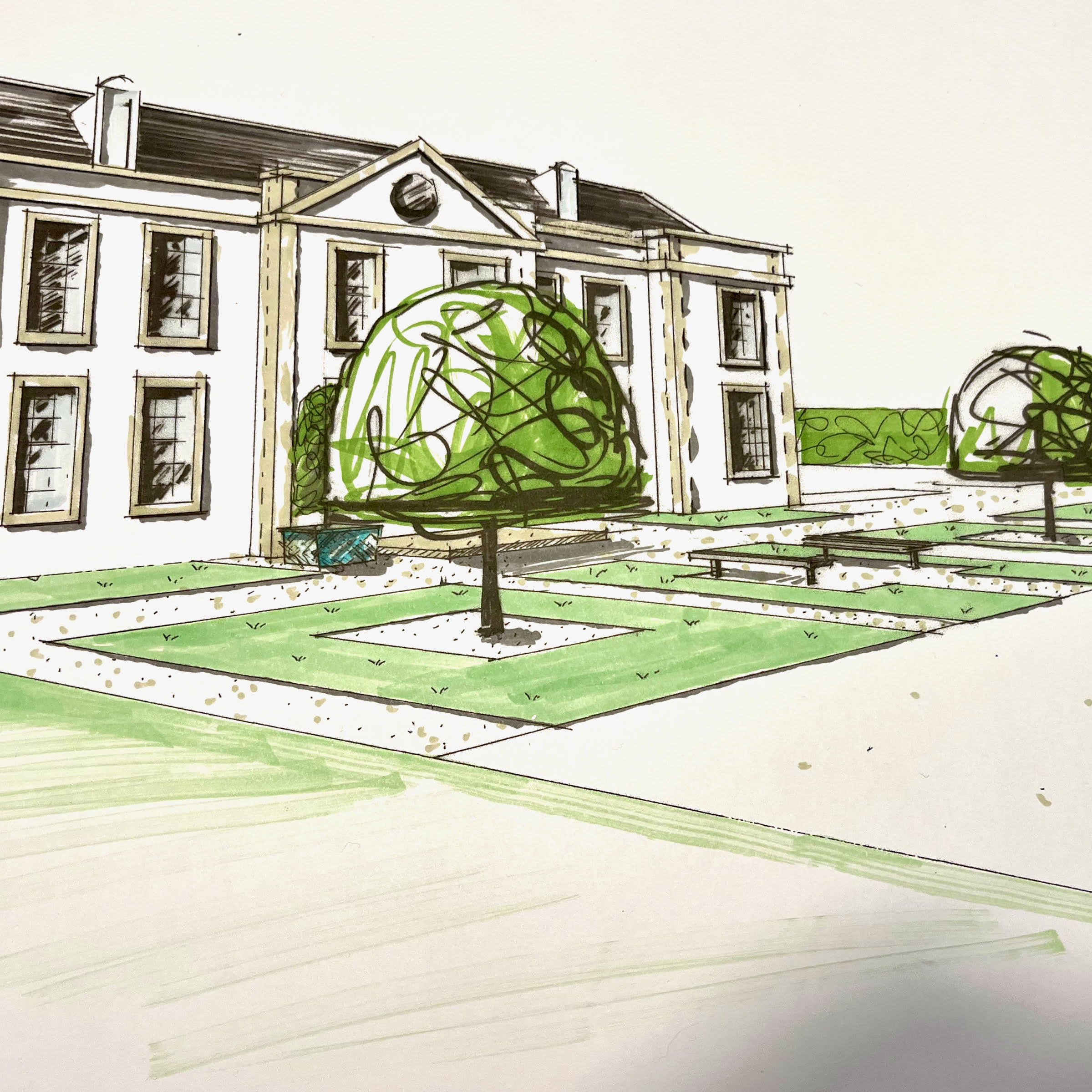
I showed these sketches showing 3 of the options I proposed with either 2 or 3 squares.
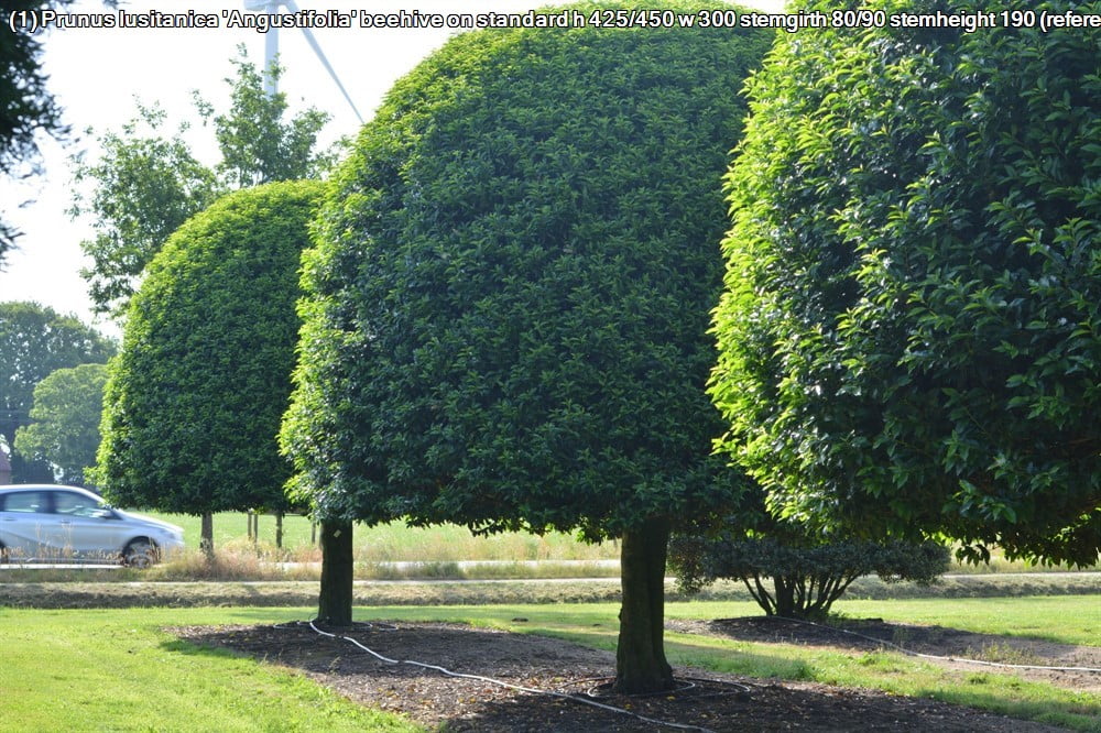
I also sourced trees from the very wonderful Solitair nursery in Belgium. …
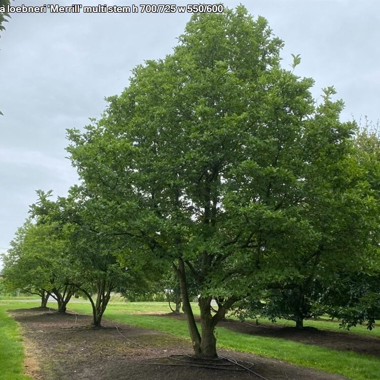
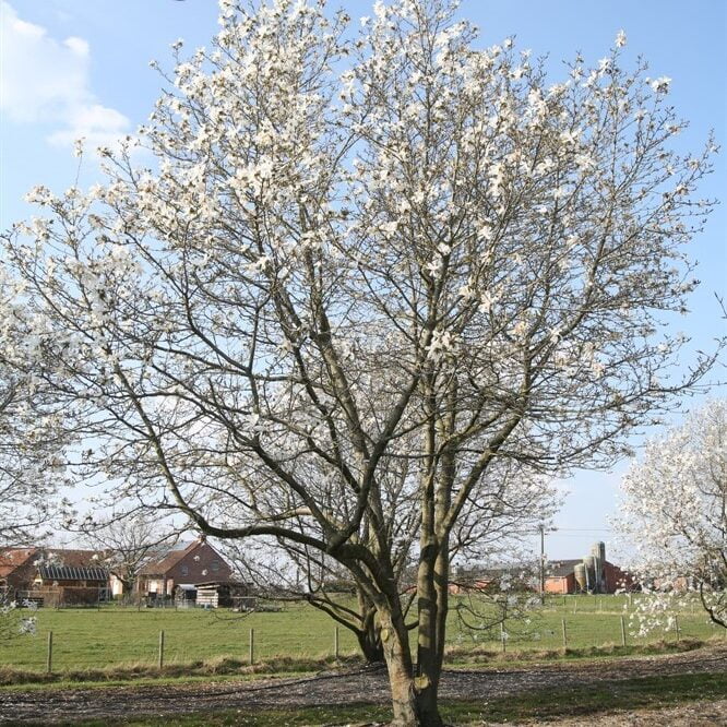
Magnolia Merrill in flower available at Solitair nursery
Aren’t they marvellous?!
It was a very productive discussion. Ginni loved the last option with 3 squares…here is the plan
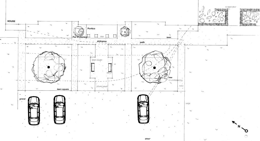
Rob wondered if the central square could be planted as beds instead of lawn – similar to the beds within the kitchen courtyard. I readily agreed as this would definitely soften the look & appear far less commercial & more friendly. I then wondered if the 2 squares beneath the trees should also be planted to balance things up. We’ll definitely uplight the trees too & Ginni really loved the magnolia idea …
So there you have it. Decision made – & with this one it’s been quite a process spanning 4 years which is sometimes the case, particularly when it’s such a large project as this country estate has been. This final design will look great & really compliments the house. As would the first design but for all the reasons I’ve listed this one works for my clients & for the plot. I love drawing & ideas are my ‘thing’ so all is well & I can now look forward to seeing it become a reality.
’til next time
